Wednesday 11 May 2011

Evaluation Question 4

How did you use new media technologies in the construction and research, planning and evaluation stages?

I used a wide range of media technologies throughout the research, planning, construction and evaluation stages of my media project. I used Google Blogger through the entirity of the project to show my progression and thought process in the build up to my final music video. At the beginning I used websites such as Google.com for research on music video directors and theorists, I used unsigned.com to find an unsigned artist and I used youtube.com to watch and analyse music videos.


I also used the television so that I could use music
on demand to select a music video to analyse, such as Kelly Clarkson - 'Since U Been Gone' and then pause the t.v to take a photo of the screen and upload the images to blogger so that I had embedded screen shots from music videos.

When filming my music video, I used a high quality video camera and a tri-pod to ensure that I had steady shots to make my video seem more professional. After filming, I used a programme named I-movie on the Apple mac computers to edit my filming. I found this extremely useful as I was able to apply many effects and filters to my shots.


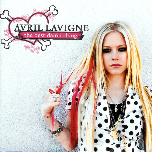
When producing my digi-pack, I used a high quality digital camera to take several possible photos to use in my digi-pack and magazine advert. I then used a programme names Picassa photo editor which is similar to Photoshop to edit my images.

Also, in the evaluation stage, I used a built in webcam to record myself answering Evaluation Question 1.

Evaluation Question 3

What have you learned from your audience feedback?

After completeing my first draft of my music video and showing it to teachers and students, I recieved a variety of feedback. One of the main critisisms I recieved was that my video was too calm and relaxed and looked more like a pop song and therefore was advised to film more shots of the singer being angry and rebelling as to show that she is heart broken and angry at her boyfriend for leaving her for another girl.


Here is an example of a shot which I removed as it was too calm:


I acted on this feedback and replaced these shots with new filming that showed the singer's rebellious side and shows how how angry and upset she is. Here is an example of a new shot I filmed and used in my music video to show the singers anger:


From this feedback, I learned that upbeat pop/rock songs about heartbreak are more successful when the video exaggerates the anger of the singer and shows the singers rebellious side in order for the visuals to suit the rythhm and lyrics of the song and to keep the viewer entertained and engaged. I was also advised to edit the shots of the singer miming as they were too long and therefore the viewer might get bored or loose concentration, therefore, I also learned that fast paced songs need to have fast paced editing to entertain the viewers.

I acted upon this feedback and re-filmed some shots and edited the singers miming to create my final music video. I then showed my video to the same teachers and students and was given positive feedback. Some students said that my video now showed the singers anger and was more dramatic and therefore, entertaining which kept them wanting to watch the video. Another student also commented that my music video looked like an Avril Lavigne video which I was really pleased to hear as this was the type of music video I was trying to create.

From this I learned that I had clearly shown my artists style and genre of music as it had been compared to an Avril Lavigne music video and that my music video was entertaining as the visuals matched the lyrics of the song.

Evaluation Question 2

How effective is the combination of your main product and ancillary texts?

I think my music video, digi-pack and magazine advert work well together as they are all very similar. I think I have made my genre clear through these three products as the singers style of clothing is similar in all three products and I have also kept similar colour themes such as black and pink, as black represents rock music and pink represents pop music.

In my digi-pack and magazine advertisement I have used the same hand written style font as I wanted the text to look like it had been written on, as this makes the digi-pack and magaine advert seem personal to the consumers as it seems as though the singer has wrote the text on every digi-pack sold. I also used this as Avril Lavigne has also used this hand written text on her 'The Best Damn Thing' album. I think this shows the creative side of the artist which would appeal to teenage girls with large imaginations. It could also be seen as graffiti, as the front cover of my digi-pack, is a photo of the singer drawing stars on the wall which could again hint at her rebellious side, which also compliments the genre of rock/pop. Similarly, in my music video I have also shown the singer drawing a broken love heart in a sketchpad to again show her creative side which will appeal to teenage girls.


I have used a theme of stars in all three products. For example, I have used stars in my digi-pack and on the singers clothing in the music video as she wore a black top with silver stars on it. Avril Lavigne is also known for using stars in her clothing, digi-packs and magazine adverts as stars are often associated with pop/rock music. Therefore, I also used a theme of stars in order to appeal to and attract my target audience.

I think the combination of my products has established what type of artist the singer is, what genre of music she sings and what style and image she has. These are important marketing factors as these help to attract the target audience. Through my products I have presented the singer as being a 'rock chick' who is creative, rebellious and is also an ordinary girl as her fans would be able to relate to her.

Evaluation Question 1

In what ways does your video use, develop or challenge the forms and conventions of real media products?


I mentioned in my evaluation video that I got inspiration for the shot where the singer in crying in the mirror with black make-up running down her face from Linkin Park's crawling video. Here is the original shot from Linkin Park's music video and my version of the shot:


Real Products

I think my products are similar to real products on the market. As I mainly looked at Avril Lavigne for inspiration, I aimed to style my chose unsingned artist in a similar way to Avril Lavigne and therefore wanted my music video to be similar to that of Avril's. I also wanted my digi-pack and magazine advert to look similar to hers.

Here is an example of one of Avril's digi-packs for the album 'The Best Damn Thing':


I think my digi-pack is similar to this as I have also used hand writing styled font which seems like graffiti and makes the artist seem creative. I have also used a theme of stars as this is a girly style, however, stars are also associated with the pop/rock genre. I also have used the colours black and pink as black represents rock music and pink represents pop music.

Monday 9 May 2011

Brand Identity

In the three products I have made, I have used the smae style throughout them I wanted to clearly show what genre my song and artist is as I think it is important to do this as this will appeal to and therefore attract the target audience to buy the singers cd.

In order for me to show the singers genre, I ensured she wore clothing of the same style in the music video, digi-pack and magazine advert. I also used a theme of stars throughout my three products, as Avril Lavigne, who is a successful artist in the same genre of pop/rock also uses stars in her clothing and digi-packs. In my digi-pack and magazine poster, I used a hand writing style font to make it seem as though it is the singers writing, which I think would make the digi-pack's seem personal to her fans. I also thought this was an effective font as it seems like graffiti and therefore shows the singers rebellious and creative style which also matches her pop/rock genre.

I think throughout the threee products I have made, I have created an image for the singer which will help to attract her target audience. I have presented the singer to be creative, rebellious, but also I have presented her as being an ordinary girl and therefore, her fans will be able to relate to her, and this will encourage them to buy her cd.

Sunday 8 May 2011

Digi pack explained

I used a recurring theme of stars in my digi pack, magazine advertisement and music video as one of my idols, Avril Lavigne, who is from the same genre as my chosen unsigned artist of pop/rock, is also associated with stars. Also, as I like stars, and my target audience is teenage girls, I thought it would be an appropriate theme to use. I named the album 'As Silent As Stars' as I wanted a reference to stars. I also named it this as I think it is a nice metaphor for a teenager who gets upset but hides it and never complains. As 'slow it down' is about a girl being confused and upset and wanting to runnaway from it all, I thought this title might suit the album.

Saturday 7 May 2011

Costume

In order for me to appeal to my target audience and to dress appropriately for the genre of my chosen song, I looked at some of my favourite artists that have a similar genre of music to pop rock such as Avril Lavigne and Amy Lee from Evanescence. I looked at their styles and tried to pick out different costumes for me to wear for my music viedo and digipack photos based on their style. I also looked at their hairstyles, make-up, the colours of their clothes, style of photos, effects and their photo poses.

Thursday 5 May 2011

CD design for digi pack


The back of my digi pack before and after


I decided to edit the original picture I took as it was too bright and colourful and looked more like a pop album design. Therefore, I edited the floor black in order to create the black and pink theme often associated with pop/rock and pop/punk. I also made a song list as this is a convention for all digi packs. To make the Digi pack image more realistic, I also added a bar code.

Digi pack booklet pictures before and after editing them


I decided to edit this original photo as I wanted the floor to be black in order to make the vibrant colour of my skirt stand out. I also brightened the backround to make it seem as though the photo was taken against a white background which makes the photo look more professional.


I also edited this photo as the original came out quite dull, so I therefore, brightened the image to make the photo more eye catching and professional. The brightness also makes the image glow. I thought this was a unique effect as it also makes the image striking and makes the colour theme of black and pink stand out.

Magazine poster before and after editing


I adjusted the brightness, contrast and shadow on the photo as I wanted a white background and a shadowed floor in order to make the singer stand out and almost seem 3D. I also added the words 'Out Now!' to show that that this is a magazine poster as the aim of a poster is to advertise the singer and album. Therefore, fans would know that the album is now available to buy.


Tuesday 3 May 2011

Magazine advert research

For my magazine advert, I decided to produce it for rock music magazines such as Kerrang! and NME as the people that buy these magazines would be fans of my singers genre and would therefore, my advert would appeal to them more and encourage them to buy her album. These magazines have also featured adverts for many of my favourite rock bands and artists such as Avril Lavigne, Evanescence, Linkin Park, 30 Seconds To Mars, My Chemical Romance and Greenday.


Tuesday 22 March 2011

Kelly Clarkson Since u been gone analysis

Another music video that I looked at and gained inspiration from was Kelly Clarkson's 2005 video 'Since u been gone.' The narrative of my music video is also similar to the narrative in 'Since u been gone' as Kelly Clarkson's boyfriend has also left her for another girl. My music video is also the same genre as Kelly Clarkson's 'Since u been gone' as they are both pop/rock genres.


A medium close up is used to show Kelly Clarkson holding a heart locket. This symbolises Kelly's heart break as later she puts it down.


Similarly, I have also used the symbolism of a heart by using a close up of a sketch of a broken heart that the singer has drawn to show she also has a broken heart.


Long shots are used to show Kelly Clarkson trashing her boyfriends apartment as she is angry that her left her for another girl and therefore wants revenge on him. For example, she throws his clothes out of his cupboards, pushes his cd rack over, smashes a photo of him and his girlfriend and rips up his pillows and jumps on his bed. In my music video, I also trashed my bedroom and used long shots to show the singer pushing a chair over violently and wiping papers off a desk to show the singers anger.


There is also a performance in 'Since u been gone' where we see Kelly performing on stage to a crowd of happy fans. Close up's are used to show her singing in order for the viewer to get an experience of what she would be like to see live. Similarly, I have also used close up's of the singer singing in my music video to promote the singers image and to appeal to my target audience through her style of clothing, hair style etc.


A tracking shot is used in the video to show Kelly Clarkson's ex-boyfriend walking with his new girlfriend. This shows that he has left Kelly for someone else and thats why she has trashed his apartment. Similarly, I used a medium shot in my video to show the singers boyfriend hugging another girl. This therefore explains why the singer is angry and upset as her boyfriend has also left her for someone else.